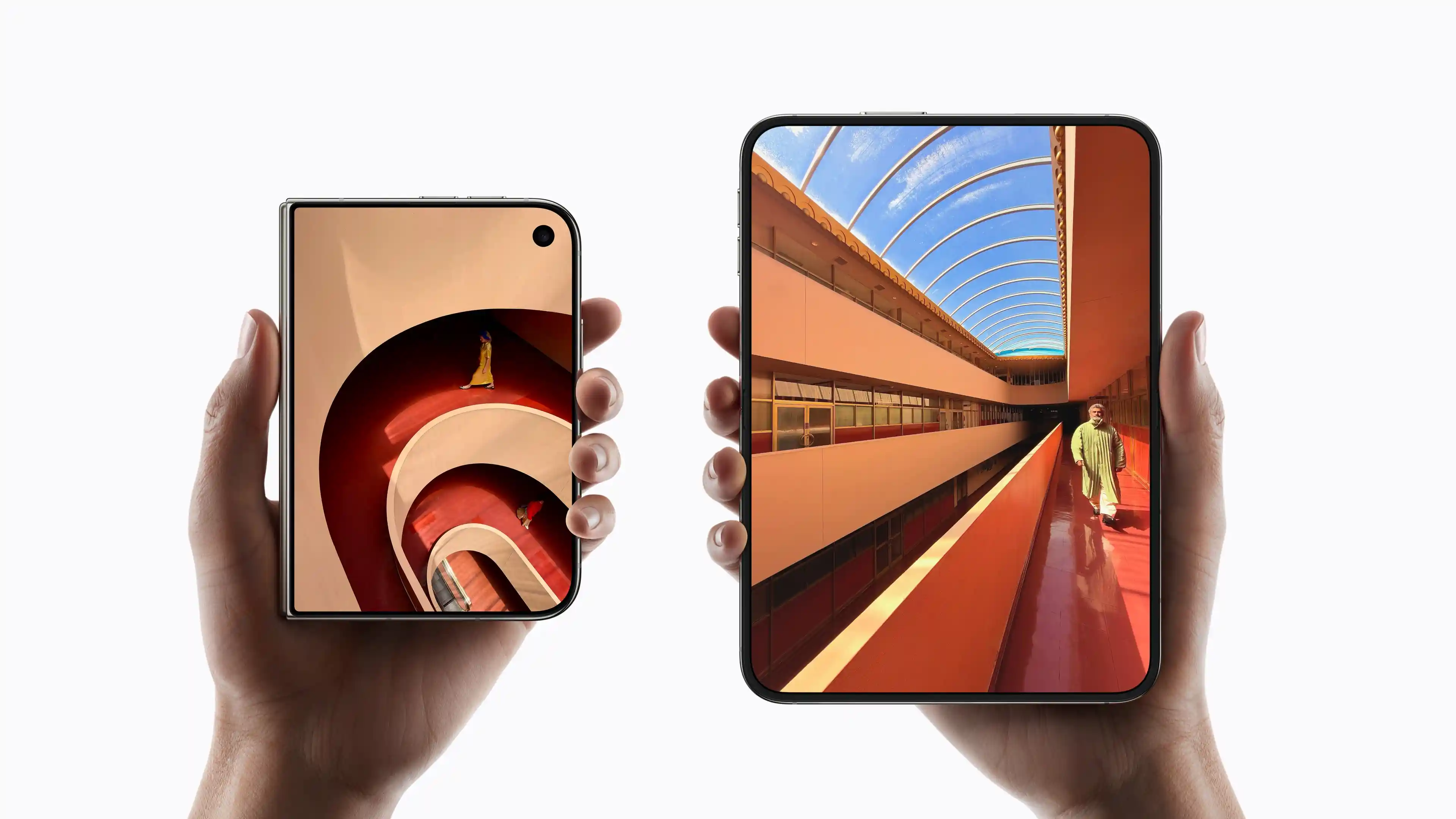
Apple has unveiled the iPhone Duo, the first foldable iPhone. The headlines are about the 7.6-inch inner display, the titanium frame and the price. The genuinely interesting design decision sits almost unnoticed in the spec sheet: both displays share the same aspect ratio. And that ratio, once you do the maths, is an old acquaintance. It is 1 to the square root of 2. The proportions of DIN A4.
The numbers
The inner display resolves at 1878 × 2670 pixels. That works out to an aspect ratio of 1.42:1. The square root of 2 is 1.414. The deviation is half a percent, which is the range explained by rounded corners and manufacturing tolerances. The outer display comes in at 1398 × 2034 pixels, a ratio of roughly 1.45:1. Slightly narrower, but close enough that Apple describes both formats as identical.
That the match is deliberate rather than a by-product comes from Apple itself. The press release for the device states that both displays share the same aspect ratio so content scales proportionally. Apple calls the result visual continuity.
Why the ratio works becomes clear with a short calculation. The inner display folds down the middle. Each half is therefore half as wide at the same height. 2670 × 1878 becomes two panels of 1335 × 1878. Aspect ratio of each half: 1.41:1. The square root of 2 again.
This is not a happy coincidence but mathematics. There is exactly one aspect ratio at which a surface retains the same proportions after being halved: 1 to the square root of 2. At any other ratio the shape tips over when folded. A 16:9 display halves into 8:9, almost square. A 4:3 display becomes 2:3. Only at 1 to the square root of 2 does everything stay as it was.
Apple itself compares the closed device to a passport. The comparison is more precise than it sounds. A passport uses the ID-3 format, which is identical to ISO B7: 88 × 125 millimetres. Aspect ratio 1.42. The passport, too, is a square-root-of-2 format.
A principle from 1786
The property of the square root of 2 was described by the physicist Georg Christoph Lichtenberg as early as 1786. The engineer Walter Porstmann turned it into DIN 476 in 1922, which became the international standard ISO 216 in 1975. The starting point is a sheet with an area of one square metre, the A0. Halve it across and you get A1. Keep halving and A2, A3, A4 and A5 appear. Every format has exactly the same proportions, because the square root of 2 is the only number that stays stable under halving.
What holds for paper holds for displays. With the iPhone Duo, Apple has built the DIN principle into a device. The unfolded inner display is the large sheet. Closed, the outer display corresponds to one half of it. Whatever has a particular shape on the large display has the same shape on the small one.
Why this is the smartest decision in the device
Foldables so far have mostly ignored the problem. A narrow, tall display on the outside in phone format, an almost square tablet on the inside. Two devices in one housing, with two layouts, two design logics and a break in between that the software has to paper over.
Apple did not paper over the break, it calculated it away. A mathematical rule solves a design problem that others fight with interface tricks. For developers this means one layout that works in both states. For users it means the device feels like the same device in both states. That is the difference between a product that gets folded and a product that was conceived for folding.
What this has to do with corporate design
At first glance, very little. At second glance, everything. The DIN principle is the purest example of something that distinguishes every good design system: a single rule generates an entire system that works at any size.
That is precisely the core task of corporate design. A brand has to work on a business card just as it works on a building facade, in an app icon just as on a trade fair stand. Solve that with individual decisions and you produce inconsistency. Solve it with a rule and you produce a system.
The best corporate design systems are therefore not collections of templates but collections of ratios. A grid that divides proportionally. A typographic scale that follows a fixed ratio. A logo whose clear space derives from its own geometry. All variants of the same thought: define the ratio, not the result. Then the result scales by itself.
In branding this shows up in a simple question: can an employee who has never read the corporate design manual derive the next application from the existing material? If yes, there is a system behind it. If no, there is only a collection. Good brand design is the answer to a question nobody has asked yet.
The iPhone Duo shows how strong this idea is when carried all the way into the hardware. The aspect ratio is not an aesthetic decision but a structural one. It is the point where product design and systems thinking converge. And it is, incidentally, a rather good punchline: the most modern device of the year follows a rule older than the telephone.
What we take from it
For brands this means the decisive design decisions are often invisible. Nobody buys an iPhone because of a square root. But everyone senses whether a device is coherent in itself or not. The same applies to a corporate identity. The question is not whether the logo is beautiful. The question is whether there is a logic behind logo, colour, typography and grid that holds up on any surface.
At Design Republic we build corporate design on exactly this principle: as a system of ratios that stays stable from the smallest to the largest application. If you want to know what such a system could look like for your brand, book a non-binding demo.