Why brand guidelines aren't nice-to-have
Many companies invest a lot of time and money in developing their branding — and then release the result into the world without rules. The logo, colors, fonts and tonality do exist, but no one knows exactly how they should be used. The result: inconsistency. On the website, the brand looks different than in the pitch deck, the logo is sometimes used with or without a shelter, and every employee interprets the brand values in their own way.
Brand guidelines solve exactly this problem. They are the central set of rules that determine how your brand should appear visually and communicatively — anywhere, anytime and by everyone who works with your brand. Whether it's an internal team, an external agency or a freelancer: Everyone works according to the same rules and creates a consistent brand experience.
What are brand guidelines exactly?
Brand guidelines — also known as a style guide, brand book or corporate design manual — are a document that summarizes all rules and standards for the visual and communicative presentation of a brand. They define how the logo is used, which colors are used, which fonts are allowed, how images are selected and what tone of communication should be.
Unlike a single mood board or a loose collection of design files, brand guidelines are mandatory. They create a clear framework within which designers, copywriters and marketing managers can operate — without diluting the brand.
The scope of brand guidelines varies depending on the size of the company and the complexity of the brand. For a startup with a single brand, 10 to 20 pages are often enough. Companies with multiple sub-brands and global markets, on the other hand, work with extensive systems that can span hundreds of pages.
The most important components of professional brand guidelines
Every good brand guideline covers a number of key areas. Together, these components form the visual and communicative ecosystem of your brand.
1. Brand essence and positioning
Before it comes to design, brand guidelines need a strategic basis. Who is your brand? What are their values? What is the brand promise? This information gives context to all stakeholders and helps them understand why certain design decisions were made. Without this foundation, all visual rules remain arbitrary.
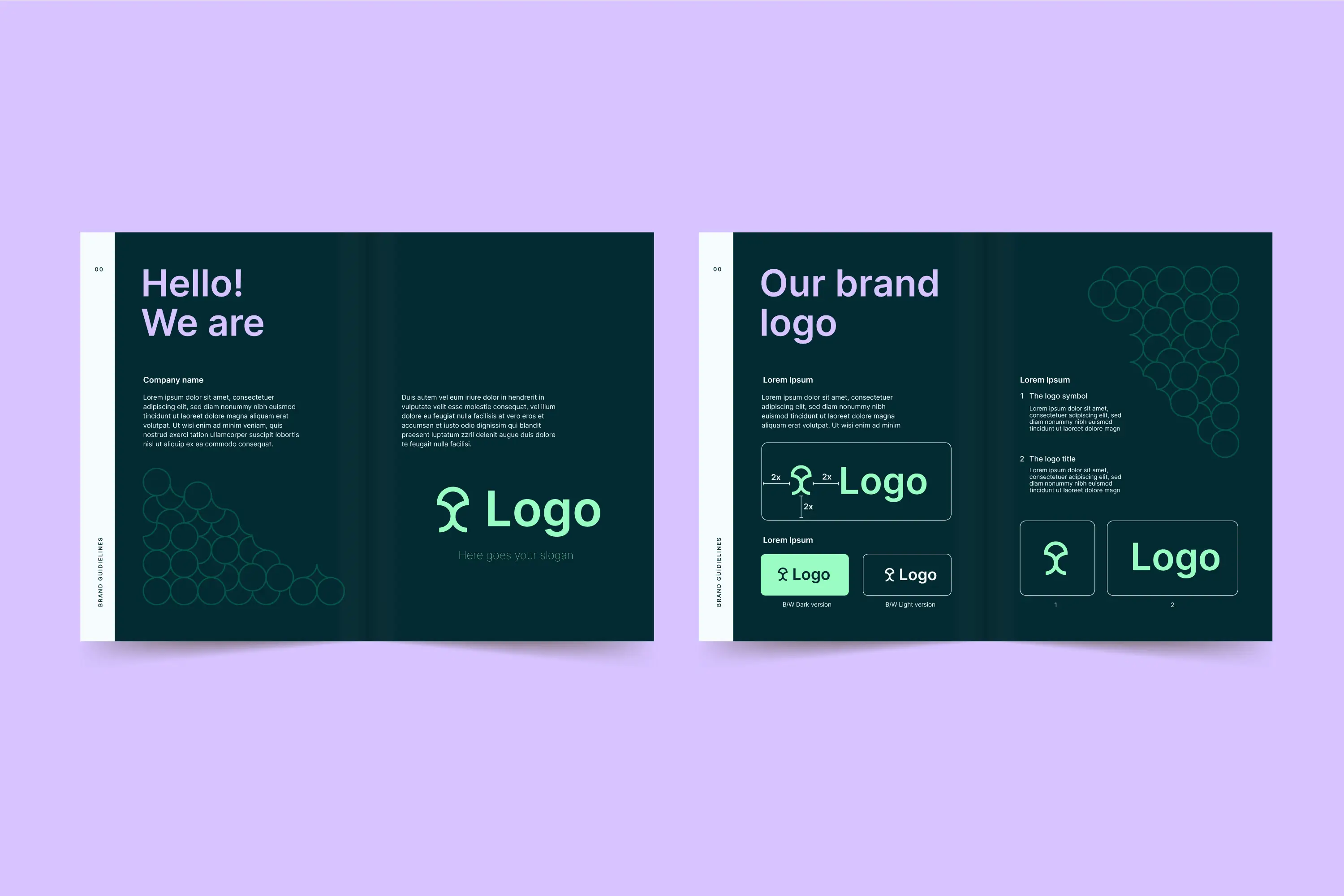
2. Logo and logo usage
The logo is the most recognizable element of your brand — and at the same time the most frequently misused. Good brand guidelines show all approved logo variants, define minimum sizes, define shelters and show clear examples of how the logo must not be used. These include negative examples such as distorted proportions, incorrect color combinations or insufficient contrasts with the background.
3rd color palette
Colours convey emotions and create recognition. Your brand guidelines should define a primary palette with your brand's main colors and a secondary palette for complementary accents. Each color includes the exact color values in all relevant color systems: HEX and RGB for digital applications, CMYK for print and, where appropriate, Pantone references for spot colors.
4. Typography
The choice of font influences how your brand is perceived — factual, creative, modern, traditional. Brand guidelines determine which font families are used, which font styles are intended for headings, continuous text and awards, and what font sizes and line spacing should look like. Particularly important: also substitute fonts for cases where the primary font is not available.
5. Visual language and photography
Images shape the emotional impression of your brand more than any other component. Brand guidelines define the style of the visual language: Are the photos warm or cool? Natural or staged? Do they show people or abstract motifs? What color scheme do they have? A clear visual style ensures that your brand appears visually in one piece on website, social media and print materials.
6. Graphic elements and icons
In addition to logos, colors and fonts, many brands use additional graphic elements — patterns, shapes, lines, icons or illustrations. These elements strengthen the visual identity and create recognition value. Brand guidelines define which elements exist, how they are used and in which context they are used.
7. Tonality and language
Brand guidelines are not limited to the visual. The language level is also part of this: How does your brand speak? Is she first name or sigh? Is the tone of voice loose or formal? Does she use technical terms or simple language? These rules ensure that your brand has a consistent voice across all channels — from websites to newsletters to social media.
How to create brand guidelines in five steps
Creating brand guidelines is not a weekend project. It's a structured process that requires strategic thinking, design expertise, and a clear understanding of your brand.
Step 1: Define brand strategy
Before you start designing, you need clarity about your brand. What are your values? Who is your target group? What makes you different from the competition? What feeling do you want your brand to make people feel? These strategic principles determine all subsequent design decisions and should be at the beginning of every brand guideline.
Step 2: Develop a design system
Based on the brand strategy, the visual components are defined: logo, color palette, typography, visual language and graphic elements. This step requires professional design expertise, because the individual elements must not only function on their own, but also work together as a system.
Step 3: Document rules and application examples
Each design element needs clear usage rules. What is the minimum size of the logo? Which color combinations are allowed, which are not? What do correct and incorrect applications look like? Application examples are just as important as abstract rules — they show in concrete terms what the brand looks like in practice.
Step 4: Ensure format and accessibility
Brand guidelines are only of any use if they are actually used. This means that they must be available in a format that is accessible and easy to understand for all parties involved. Digital PDF documents, interactive websites or tools such as Frontify or Figma libraries are common formats. It is important that the guidelines are stored centrally, kept up to date and easy to find.
Step 5: Maintenance and Development
Brand guidelines are not a static document. Markets are changing, companies are growing, new touchpoints are emerging. Schedule regular reviews to keep your guidelines up to date and adapt them to changing requirements. A design system that is not maintained quickly loses its relevance and is ignored by teams.
Common mistakes in brand guidelines — and how to avoid them
Even well-intentioned brand guidelines can miss their purpose if typical mistakes are made.
Too complex and too long
If your brand guidelines are 200 pages long and no one reads them, they're worthless. Keep them as slim as possible. Focus on the rules that are really needed in everyday life and outsource special cases into separate documents.
No practical examples
Abstract rules without context lead to room for interpretation — and room for interpretation leads to inconsistency. Always show specific application examples: This is what a correct business card looks like, such a correct social media graphic, such a correct presentation.
No do's and don'ts
People learn at least as well from negative examples as from positive templates. Explicitly show how your brand should not be displayed. This prevents the most common mistakes and makes the rules tangible.
Not a clear owner
Brand guidelines need a responsible person or department to ensure that they are complied with and updated. Without clear accountability, guidelines quickly become obsolete and are increasingly ignored.
When does your company need brand guidelines?
The short answer: as soon as more than one person works with your brand. This could be the internal marketing team, an external design partner, a PR agency, or a freelancer who creates social media graphics. The more participants there are, the more important a binding set of rules becomes.
Brand guidelines are particularly relevant in the following situations: after a rebrand or repositioning, when scaling the team, when onboarding new agencies or partners, when expanding into new markets and when launching new products or services under the existing brand.
The difference between style guide and design system
Brand guidelines and design systems are often used interchangeably, but they are not the same thing. A style guide documents the visual and communicative rules of a brand — it describes what something should look like. A design system goes one step further: It provides reusable components, patterns, and code snippets that can be used directly in production.
For most companies, a solid style guide is enough as a starting point. As the company grows and the number of touchpoints increases, the style guide can be gradually expanded into a complete design system.
Conclusion: Brand guidelines are the foundation of consistent brand management
Brand guidelines are not a bureaucratic overhead — they are the foundation on which consistent brand management is built. They give teams direction, protect the brand from dilution and ensure that every touchpoint provides the same brand experience.
Whether you're just starting to build your brand or want to structure an existing brand, the first step is always to write down the rules and make them accessible. The earlier you start, the fewer corrections you'll need later on.
At Design Republic, we help companies implement everything from a brand strategy to the finished style guide — quickly, in a structured manner and without agency overhead. If you would like to have your brand guidelines professionally created or revised, then book a demo and let us talk.