Why the logo is more than just a pretty picture
When dental practices think about their branding, the discussion almost always starts with the logo. This is understandable: The logo is the most visible element of the practice brand. It is emblazoned on the practice sign, on the business card, in the letterhead, on the website and even on the toothbrush pocket at the end. No other design element is as omnipresent.
But a logo is much more than a pretty graphic. It is the visual promise of a practice. In a fraction of a second, it conveys what the practice stands for — whether it is modern or classic, whether it is aimed at families or premium patients, whether it radiates trust or innovation. A good logo makes this positioning visible. A bad logo makes the practice look interchangeable — or worse, it sends the wrong message.
What makes a good dentist logo
A professional logo for a dental practice meets a number of clear criteria. These are not negotiable — regardless of whether it is a small family practice or a large medical care center.
1. Simplicity
The best logos are the simplest. Complex illustrations with lots of details work neither in a small favicon nor on a large practice sign. A strong logo is reduced to the essentials and remains legible even in miniature size. Think of the most famous logos in the world: Nike, Apple, Mercedes — all minimalistic, all instantly recognizable.
2. Timelessness
A practice logo is usually used for 10 to 15 years. What looks modern today may look old-fashioned in five years. Good logos don't follow short-lived trends, but are based on timeless design principles. Glitter effects, gradient overlays or fashionable fonts are the fastest ways to create a logo that needs to be renewed after a few years.
3. Scalability
A logo must work in all sizes and applications — from a 16-pixel favicon in the browser tab to a metre-high practice sign on the façade. It must look the same in black and white as in color, on light and dark backgrounds, in print and digital. Logos that only work in a specific version are not practical.
4. Distinctiveness
A tooth, a toothbrush or a smiling mouth in the logo — many practices use these obvious symbols. The problem: That is exactly why most dentist logos look interchangeable. A really strong logo finds its own visual approach, which differentiates the practice of competitors and stays in the memory.
5. Appropriate statement
The logo must match the positioning of the practice. A modern premium practice with a focus on aesthetic dentistry needs a different logo than a family-friendly pediatric practice in the countryside. When logo and positioning do not match, dissonance is created — and dissonance costs trust.
An overview of the different logo types
There is no one right type of logo for dental practices. Depending on positioning and strategy, different approaches can be useful.
wordmark
A pure word mark consists only of the practice name in a characteristic typography — without an additional image element. It looks modern, self-confident and mature. Prerequisite: The practice name must be short, memorable and easy to design. For long or cumbersome names, this approach rarely works.
figurative mark
A pure figurative mark consists only of a graphic element without text. This is the ultimate discipline in logo design, because the symbol alone must be strong enough to carry the brand. Apple and Nike work that way. This approach is difficult for new practices because it takes time for the symbol to become inextricably linked to the brand.
Word-figurative mark
The word and image mark combines a graphic element with the practice name. This is the most common approach for dental practices and for good reason: The figurative brand ensures recognition, the lettering provides clarity. Both elements can also be used separately — the graphic element as a favicon or social media icon, the word mark as a practice sign.
monogram
A monogram consists of the first letters of the practice name, which are combined to form a character. This looks elegant and is reminiscent of traditional brands. For premium practices or individual practices with the owner's name, this can be a strong option.
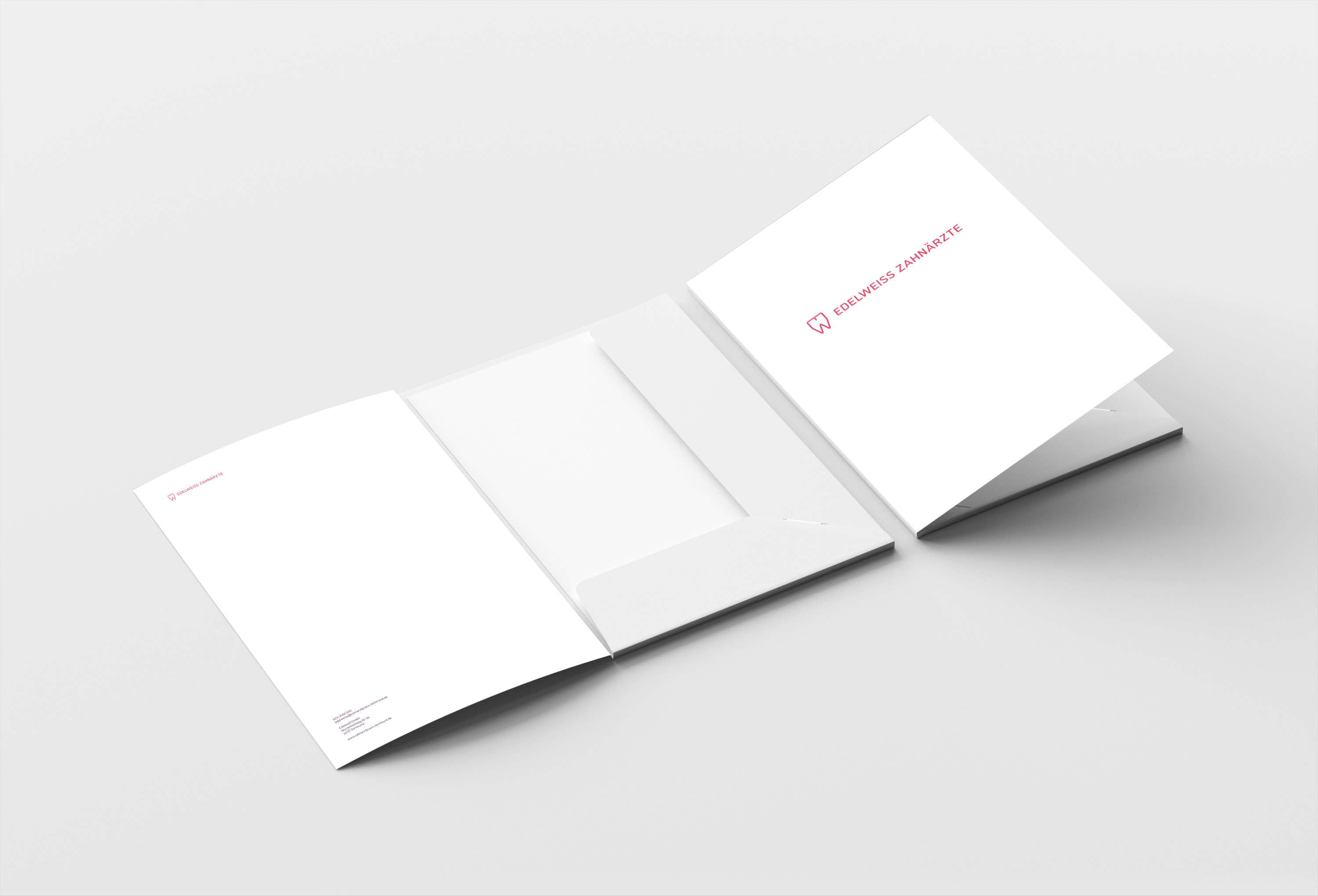
Case study: Edelweiss dentists
A good example of a well-thought-out practice logo is our project with Edelweiss dentists in Dortmund. The practice wanted to position itself as a premium point of contact — and needed a logo that conveys elegance, trust and a calm, high-quality atmosphere.
We have developed a word-image brand for Edelweiss that deliberately distances itself from typical dental clichés. The characteristic color scheme in soothing shades of blue supports the logo and ensures a clear visual identity. The result works in all applications — from practice signs to business cards to websites — and has the potential to support practice for many years.
Common mistakes with dentist logos
When developing a practice logo, the same mistakes are made over and over again. If you avoid them, you're already way ahead.
Mistake 1: cliché symbols
Tooth, toothbrush, smiling mouth, cogwheel with tooth in it — these symbols are obvious but interchangeable. If you really want to stand out, you should consciously distance yourself from it and find your own visual approach.
Mistake 2: Too many colors
Logos with four, five or more colors look restless and are difficult to use. A good logo works with one or two colors plus black or white.
Mistake 3: Effects and progressions
Shadows, lighting effects, 3D representations or smoothing look fashionable and quickly become obsolete. Flat, clear designs last significantly longer
Mistake 4: Bad typography
Typeface is often the most underrated element of a logo. A logo with an incorrect font looks unprofessional, even if the figurative mark is good. Invest time in choosing — and avoid default fonts such as Arial or Times New Roman.
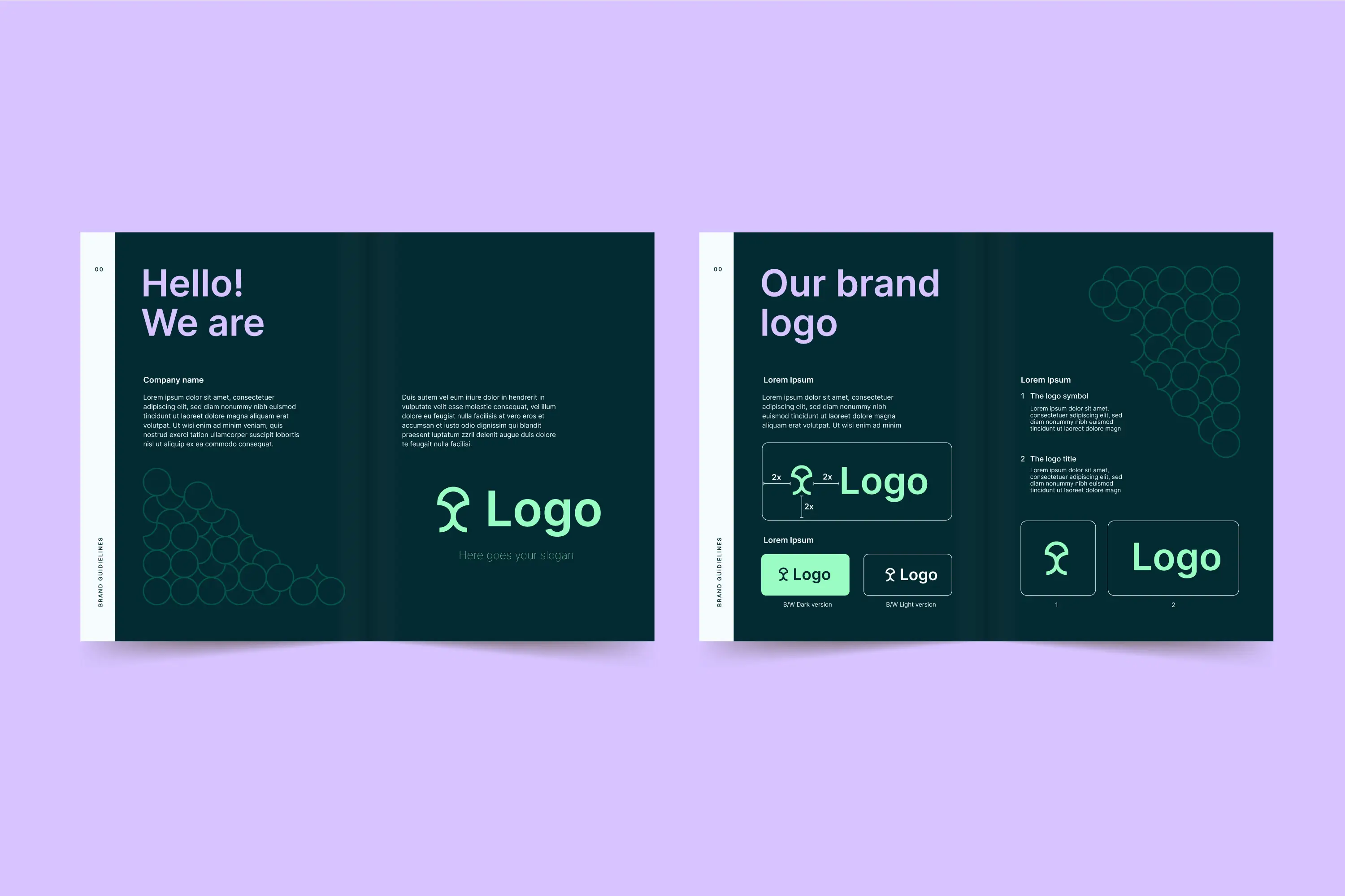
Mistake 5: No style guide
A logo without clear usage rules is used inconsistently. Which version on which background? How much space does the logo need? What is the minimum size allowed? Without a style guide, the brand dilutes with every application.
Make your own logo or have it professionally created?
Online tools such as Canva or AI-based logo generators promise professional results in minutes. The reality: The resulting logos are interchangeable, often legally problematic (because templates are sold thousands of times) and have no strategic basis.
For a dental practice that wants to use its logo for 10 years or more, investing in professional design is almost always worthwhile. Depending on the scope, the development of a high-quality practice logo costs between 1,500 and 5,000 euros — usually cheaper as part of a corporate design. In terms of useful life, this is less than 50 euros per month for one of the most important marketing assets in practice.
The path to a professional practice logo
Developing a good logo is not a creative accident, but a structured process. It starts with a briefing, in which the positioning of the practice, the target group, the brand values and the competitive situation are clarified. This is followed by a Research and analysis phase, in which references are collected, competitors are investigated and initial directions are developed.
In the Concept phase There are several logo approaches that try out different directions. The best concepts are presented in the Elaboration phase refined and tested in various applications. In the end, there is finalizing with all required file formats, a style guide and clear usage rules.
Depending on the scope, this process takes two to six weeks. Anyone who tries to abbreviate it often ends up with generic results, which later have to be improved at a high cost.
Conclusion: The logo is the foundation of your practice brand
A good logo isn't everything — but without a good logo, everything is nothing. It is the most visible element of your practice brand and will be with you for years or even decades. It is therefore worthwhile to invest time and money in development.
The best logo is one that is simple, timeless, scalable, and distinctive — and that fits the positioning of your practice. Anything else is a missed opportunity to build trust and win over patients.
At Design Republic, we develop practice logos as part of a holistic corporate design — from brand strategy to logo development to complete implementation in websites, practice equipment and patient material. We know what's important in the dental industry and implement it with a senior design team. If you want to know what a professional logo for your practice could look like, then book a non-binding demo.