KlinikRente
Fresher and warmer, but still recognizable
KlinikRente is the industry pension scheme for people working in healthcare. It offers occupational pensions and occupational disability insurance, backed by a consortium of major insurers. In 2016, the brand came across as cool and distant, more like a typical insurer or a bank. It used only one color, blue, and its marketing materials did not follow a consistent visual identity.
The goal set out in the brief: become fresher, younger and more emotional while still conveying trust and reliability. The brand was meant to stand out from the rest of the insurance market and remain recognizable at the same time.
We first explored a clear fresh start, with a new logo and a symbol of its own. In the end, we chose evolution: the logo keeps its mixed-case spelling and its underline, while the colors, typeface, key visual and imagery are new.
Before-after comparison

The development, step by step
Brand core
Our starting point was the brand core: security and stability, because several insurers in the consortium share the risk. It came with four brand personality traits: sincere, competent, robust and inspiring. The tone was clear, too: KlinikRente meets people at eye level and reaches them through emotion rather than insurance jargon.
First drafts in real formats
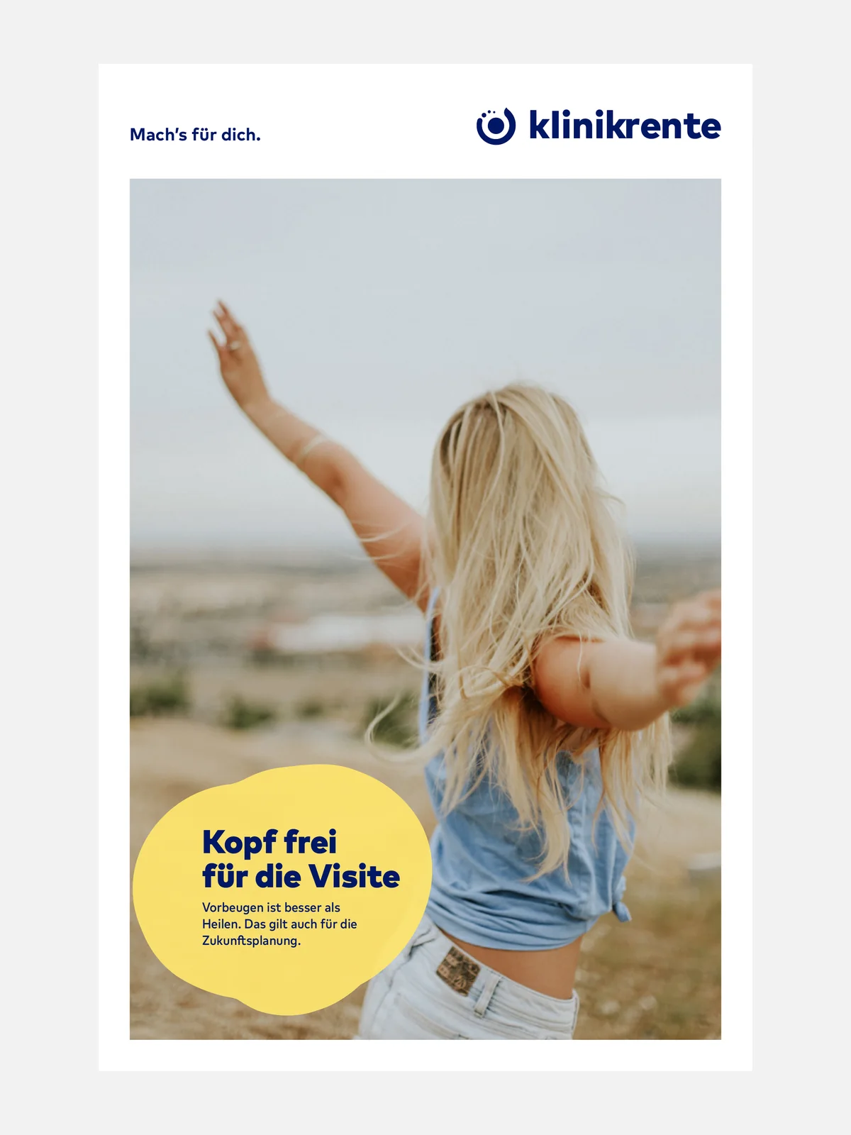
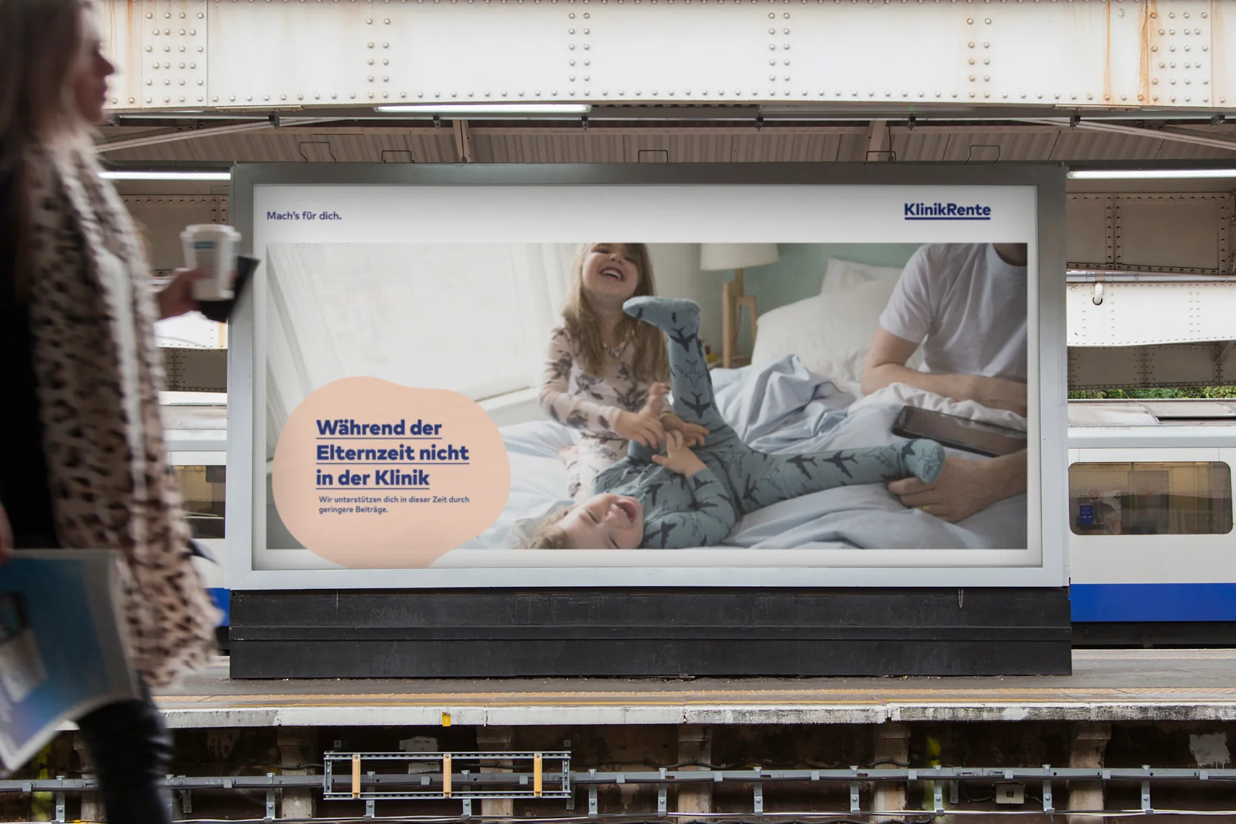
From the start, we tested the drafts where the brand would later appear: on city light posters and billboards, on flyers and brochures. The first direction was a clear break, with the name in lowercase, “klinikrente”, and a round symbol. Organic shapes in yellow, light blue and apricot carried the headline and copy, together with the claim “Mach’s für dich.” (do it for yourself).
Six logos on one billboard
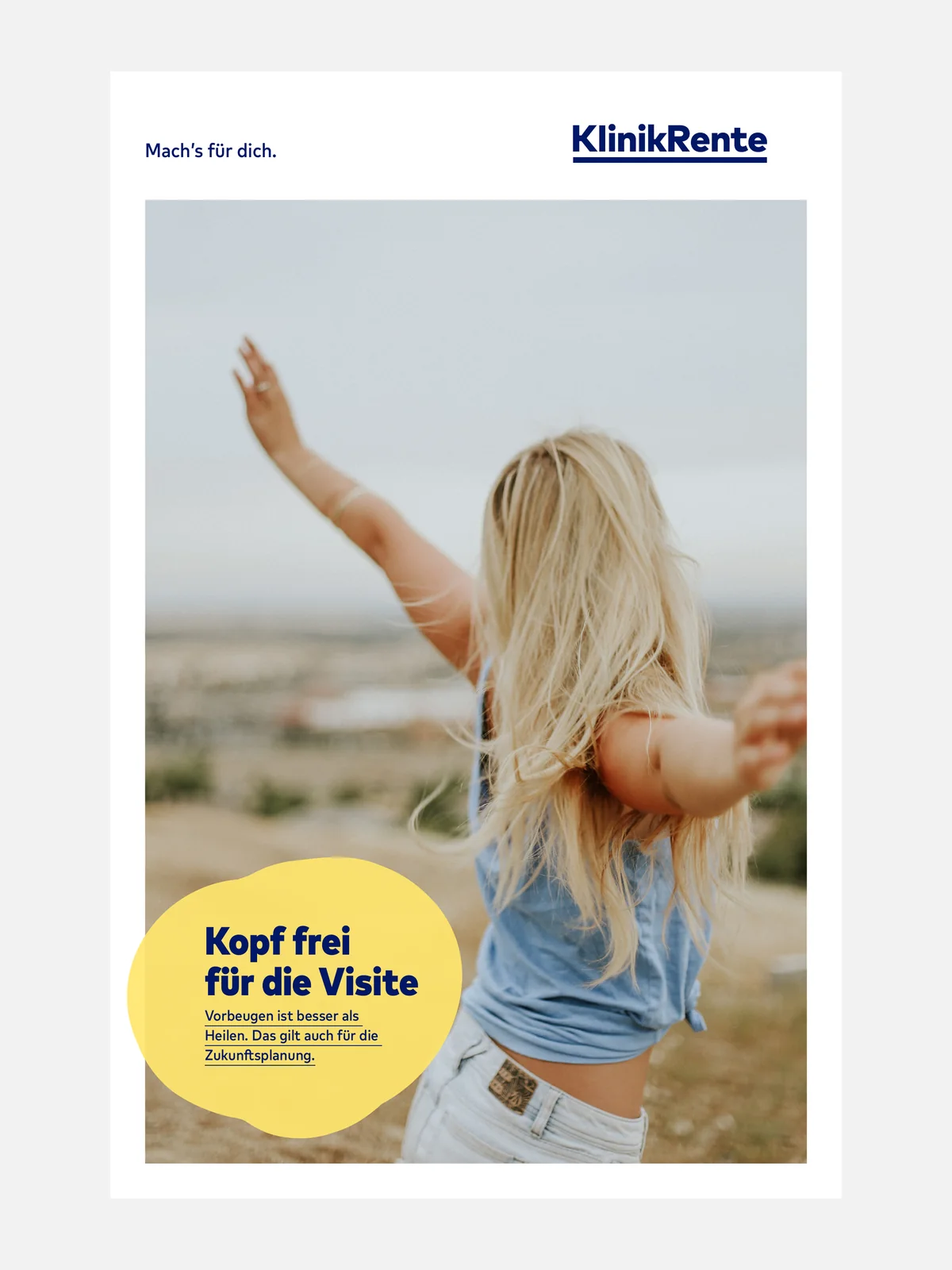
To decide on the logo, we set the same billboard design with six variants: in lowercase or with a capital K and R, each plain, underlined or with the round symbol. This made it easy to compare how much of a fresh start the brand could take. The choice was evolution: the mixed-case spelling and the underline stay, because they make KlinikRente recognizable.
The logo
The new logo is a reissue of the existing wordmark. It is now set in the corporate typeface FF Mark, a clearly constructed typeface that resembles the Arial used in the old logo. Instead of blue and black, the whole word is now in the new KR Blau (KR blue). The underline is bolder and stands for the brand core: security and stability. The addition “Versorgungswerk” has been dropped. For very small applications such as favicons, app icons, stamps or embroidery, there is a logo glyph made of the letters KR.
Blob, colors and images
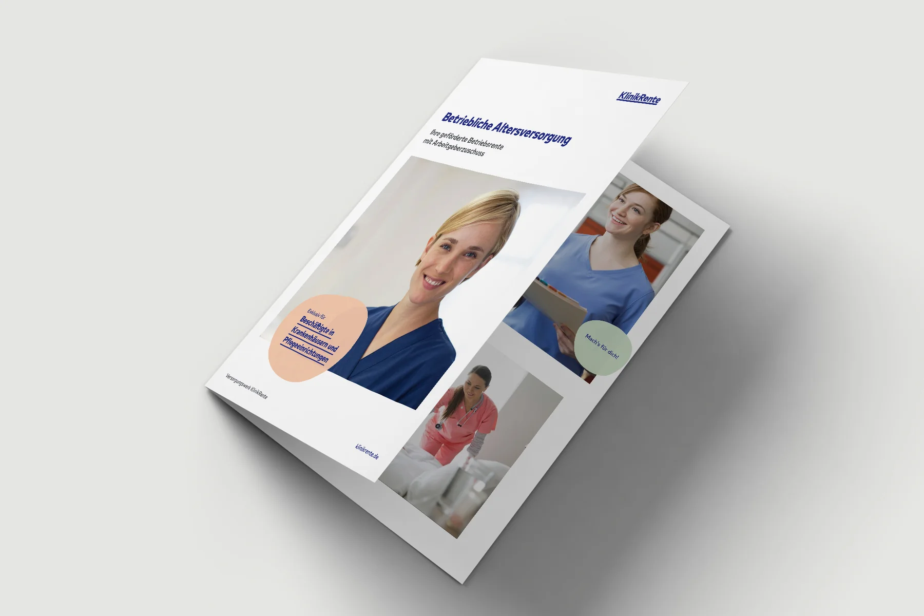
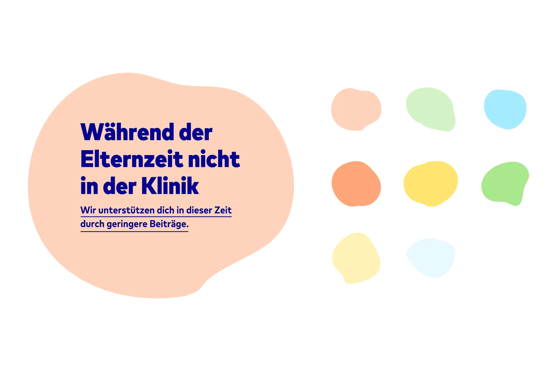
What remained from the first drafts is the organic shape, the blob. It is the brand’s key visual and runs through all media: it highlights the most important message and guides the eye. It is filled with one of the secondary colors, light blue, apricot, purple, green or yellow, while KR Blau remains the accent. The blob holds the headline and subline, and the subline is underlined like the logo.
The photos show people from the target group in their everyday lives, with natural light and a relaxed composition. Clichéd images of people in hospital clothing in front of an X-ray are the exception.
Design system and style guide
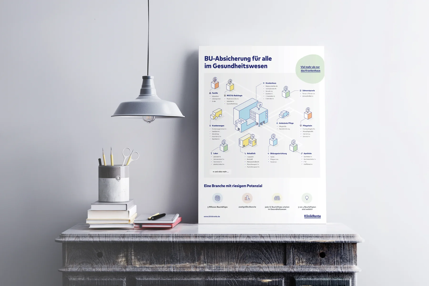
To make every application look like KlinikRente, we defined a design system: a vertical grid with horizontal guide lines and plenty of white space. The logo always sits outside the image and the blob, and the most important information goes inside the blob. Custom pictograms follow the same principle as the blob, with filled and white areas. Everything is documented in an online style guide in Frontify: logo, colors, typeface, imagery, blob, design system and pictograms, with files to download.
Applications
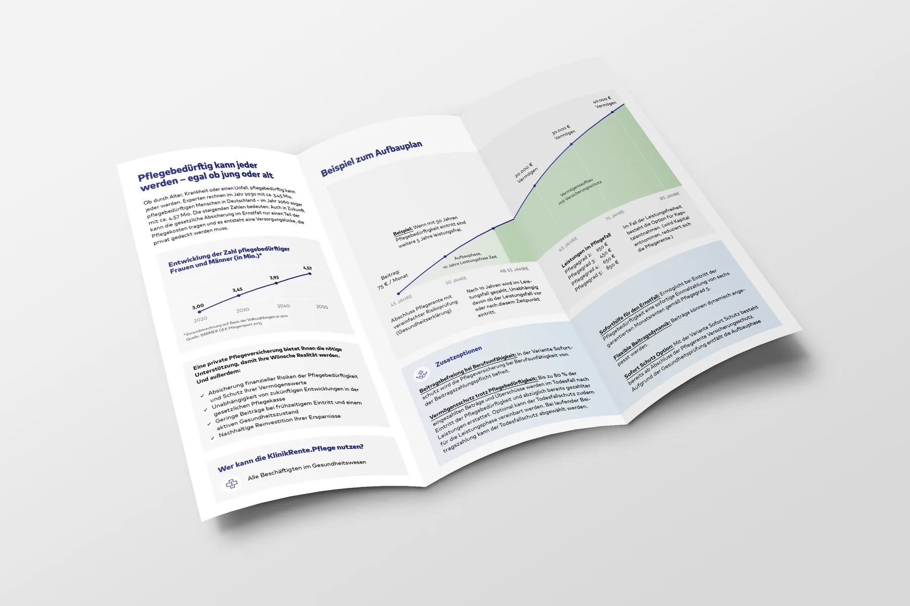
By summer 2017, we had carried the system over to the most important media: letterhead, business cards and a presentation folder, flyers on occupational disability insurance for trainees and students in healthcare and for doctors, a flyer on long-term care insurance, a brochure on occupational pensions, posters, an ad and a roll-up for brokers. For the website, we designed screens and a component library based on Atomic Design.
Still in use today
The logo, KR Blau, the blob and the claim “Mach’s für dich.” still shape KlinikRente’s brand today, almost ten years after the rebrand.