CLARA
Beautiful teeth as lifestyle, not as treatment
Preventive care such as professional teeth cleaning is perceived as a medical service. Prices are not transparent and vary widely from provider to provider, and there is hardly any marketing for these services. At the same time, practitioners have free capacity. This is where CLARA comes in: a brand under which dentists and orthodontists pool their services for beautiful teeth, with consistent quality, uniform prices and one central point of contact.
The mission fits into one sentence: the most beautiful smile for everyone. In how the brand speaks, cosmetics and lifestyle come before the medical service. Beautiful teeth should be something you treat yourself to that still remains affordable for most people. That is exactly what the brand’s three values stand for: affordable, transparent, aesthetic.
CLARA is run by Edelweiß GmbH from Dortmund, for whose practice we also developed the Edelweiß Zahnärzte brand.
From positioning to scrubs
Positioning
CLARA speaks to people who care about their appearance, from young, trend-conscious adults to best agers. Instead of technical terms, the focus is on results: bright, straight and beautiful teeth. The tone for this is affordable luxury. Those who wish can finance their treatment in monthly installments over two years.
Visual identity
The symbol shows a smile with an asterisk, next to it is the CLARA wordmark in a clean sans serif. The visual identity is monochrome, minimal, clear and accentuated: lots of white, black for type and symbol, and coral as an accent. At its center are photos of laughing people against calm, single-color backgrounds.
Website
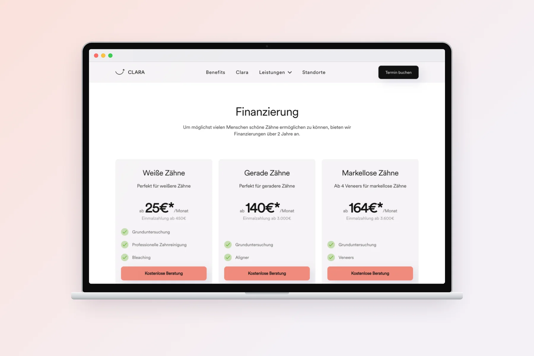
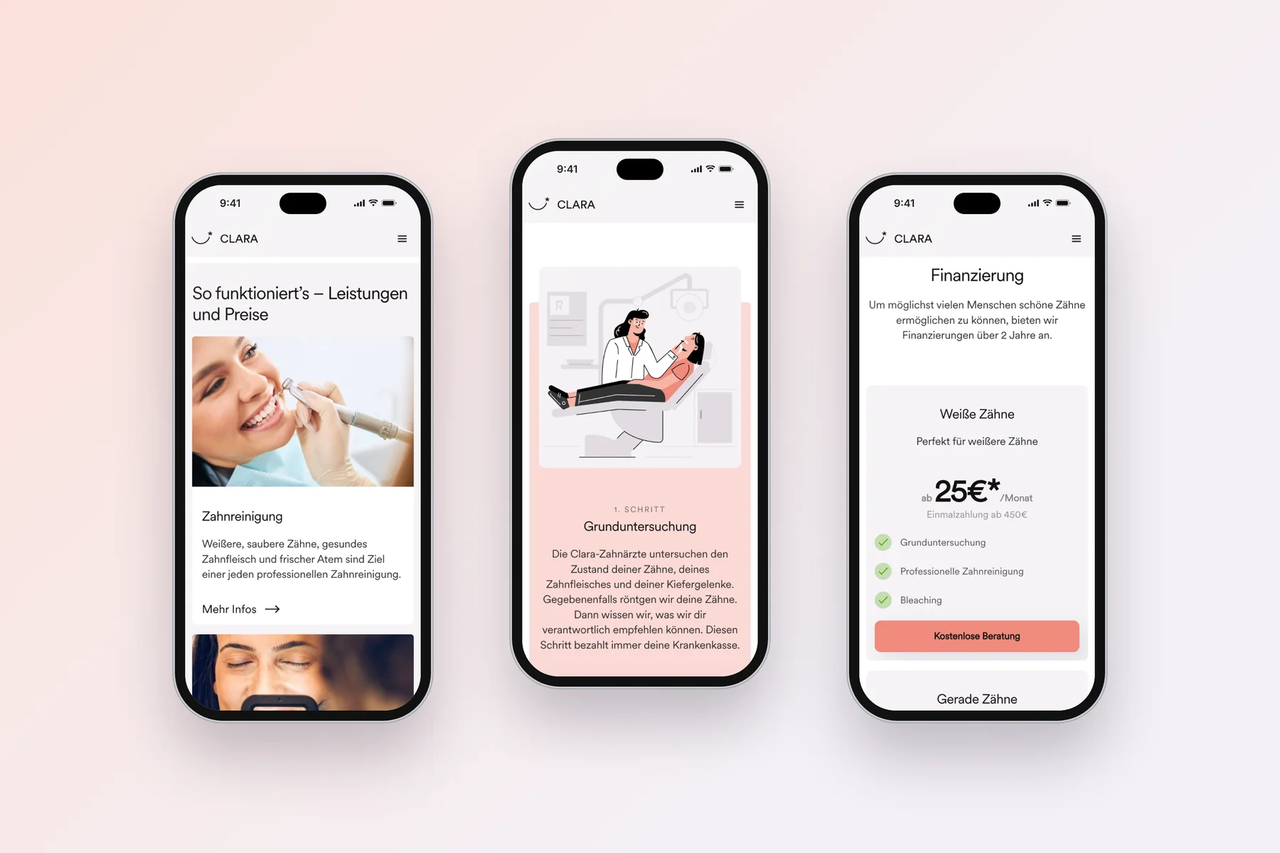
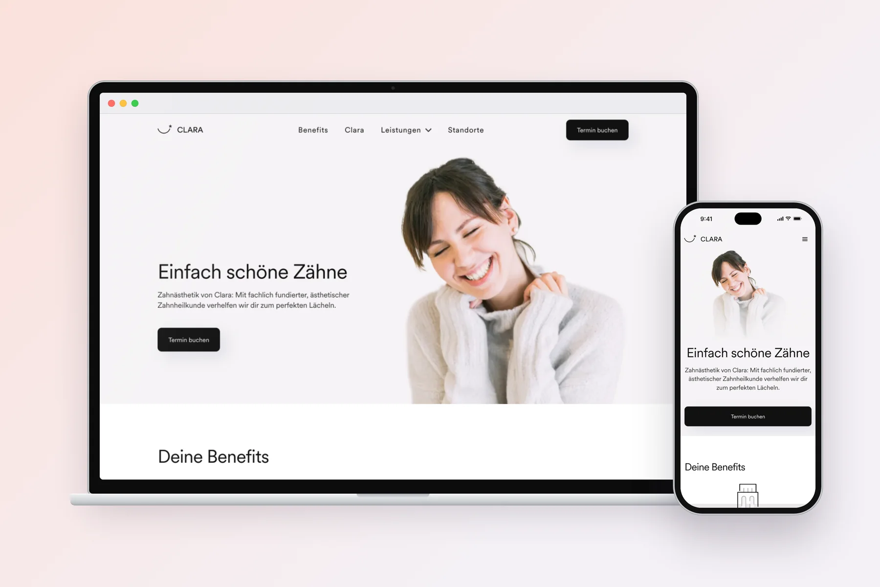
We built the website in Webflow. It presents the services, from teeth cleaning to bleaching, veneers and bonding to aligners. The process is broken down into three steps, from the initial examination to smile design. Illustrations make it easy to follow. Financing is shown as packages with monthly rates, for example for white or straight teeth. A dedicated section leads to CLARA partners nearby.
Signage and workwear
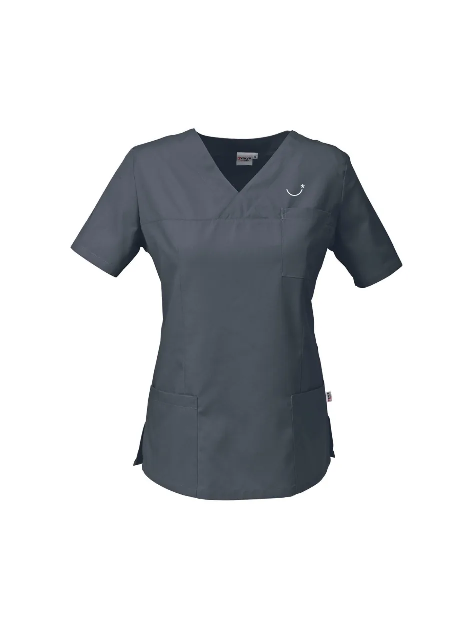
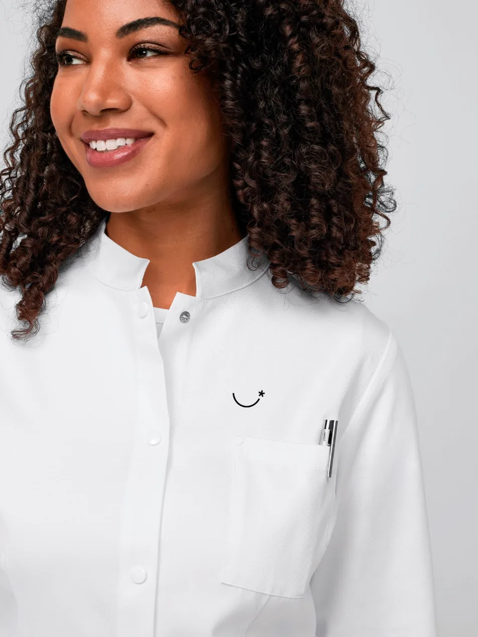
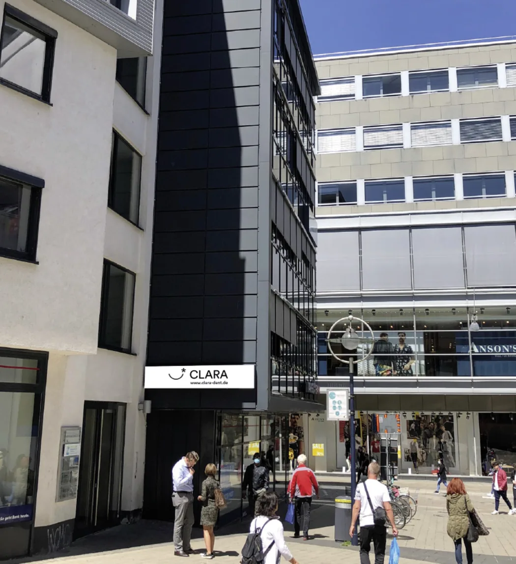
For the location in Dortmund’s city center, we designed the signage, with the logo and web address above the entrance. For the team, we designed workwear featuring the symbol: anthracite scrub tops and white short coats.