Krüger Hannover

A tile retailer enters its next chapter
Krüger Hannover has stood for tiles and natural stone since 1930. In its own showroom in the Hannover region, the company presents wall and floor coverings, from ceramics and porcelain stoneware to natural stone, along with collections such as Chiaro and wood-look tiles.
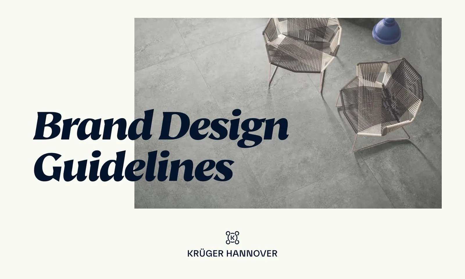
With the brand relaunch, the company was to enter its next chapter with a fresh visual identity. We redesigned the brand presence but evolved the familiar symbol instead of replacing it. Everything is set down in brand design guidelines so that the brand looks the same everywhere: on the facade, on flags, on social media and on paper.
From the guidelines to the facade
Visual identity
The new symbol is derived from the previous one: the four interlaced loops remain, and a K in a circle now sits at their center. This keeps the link to the brand's previous presence. It is joined by the KRÜGER HANNOVER wordmark. The brand colors are dark blue, a strong red and a warm off-white. Headlines are set in a bold italic serif, everything else in a clean sans serif. The imagery shows tile surfaces and living spaces, and patterns are built from a subgrid.
Brand design guidelines
The brand design guidelines bring together the rules of the visual identity, right down to templates for social media.
Applications
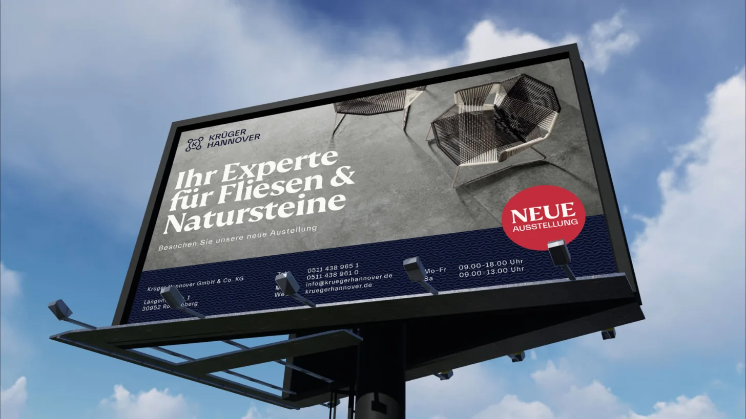
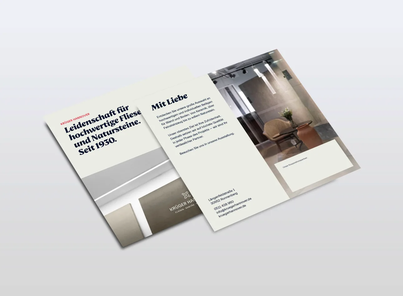
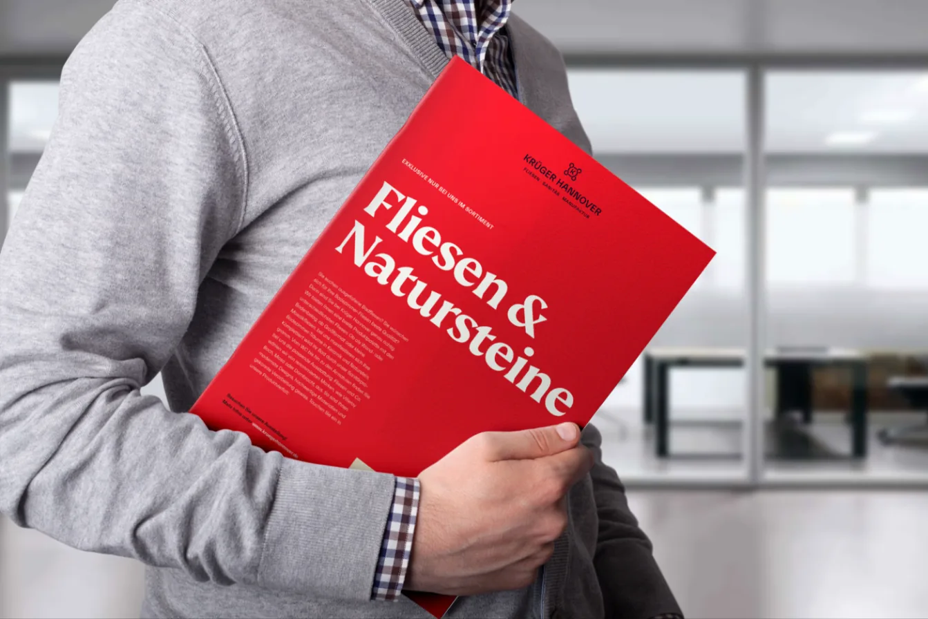
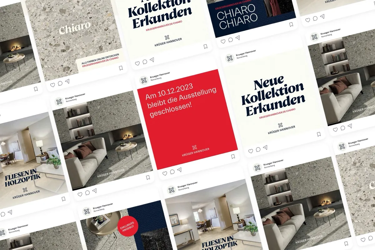
For the building, we designed illuminated lettering for the facade, signage for the showroom and flags in the three brand colors. On top of that come posters, brochures and flyers with messages such as “Ihr Experte für Fliesen & Natursteine” and “Mit Liebe”. Business cards with embossing on high-quality paper make the visual identity tangible. For Instagram, there are templates for collections, offers and notices, for example when the showroom is closed. We also designed the website in the new visual identity.