Design system definition: Basics and benefits for efficiency
A design system is much more than just a design guideline or a style guide. It represents a comprehensive collection of reusable components, guidelines, and principles that form the basis for designing and developing digital products. At its core, it is a central point of contact for all aspects of the visual and functional language of a brand or product. A well-thought-out design system promotes consistency, efficiency, and scalability throughout the development process.
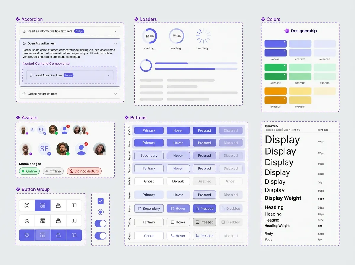
The development of a design system typically starts with identifying the core components and principles. This includes defining design guidelines that determine how visual elements should be used and creating a library of reusable UI components. These components can include anything from buttons and form fields to navigation structures and carousels. Structuring and documenting these components is crucial for their effective use by design and development teams.
Basics of a design system:
- Design guidelines: Define visual elements such as colors, typography, icons, and layouts.
- UI components: Reusable user interface elements with clearly defined functionalities.
- Code library: Contains the code for the UI components, often in the form of libraries for various frameworks (e.g. React, Vue, Angular).
- documentation: Detailed descriptions of the components, their uses, and their underlying principles.
- Design token: Variables that define design values such as colors, font sizes and spacing and make them consistently applicable.
For companies that develop complex digital products, implementing a design system can bring significant benefits. A primary advantage is increased efficiency. By reusing components and following uniform guidelines, development time is significantly reduced. Instead of having to create new elements every time, teams can rely on proven and tested components. This results in faster time to market and reduced development time.
Another important aspect is improved consistency. A design system ensures that all of a brand's digital products offer a consistent look and user experience. This strengthens brand identity and promotes user trust. Consistency also reduces users' cognitive load, as they don't have to deal with different design languages.
In addition, a design system makes collaboration between designers and developers easier. Clear and comprehensive documentation ensures that all parties involved have the same information and are up to date. This minimizes misunderstandings and speeds up the development process.
The advantages of a design system in detail:
- Increased efficiency: Reuse of components reduces development time.
- Improved consistency: Consistent appearance across all products.
- Simplified collaboration: Clear documentation for design and development.
- scalability: Enables you to add new products and features quickly.
- Reduced maintenance costs: Changes to components affect all applications.
- Improved user experience: Uniform and intuitive operation.
An example of the practical application of a design system can be found at companies such as Spotify. They have developed an extensive design system that allows their designers and developers to quickly create new features while ensuring a consistent user experience across all platforms. This investment has paid off in a faster pace of innovation and a stronger brand identity.
However, the introduction of a design system is not a one-time project, but a continuous process. It requires a clear strategy, careful planning, and active care. It is important to get feedback from designers and developers and to continuously improve the system. The integration of new technologies and trends must also be considered.
In summary, a design system is an essential tool for companies that want to develop and scale high-quality digital products. It provides a solid basis for an efficient, consistent and future-oriented design and development environment. Investing in a design system pays off in the long term through improved efficiency, a stronger brand identity, and a better user experience.
The architecture of a design system: components, styles, and patterns
A design system is more than just a collection of design templates. It is a comprehensive architecture that forms the basis for consistent and efficient design. This architecture consists of three main components: components, styles, and patterns. Each of these components plays a crucial role in the success of a design system.
components
Components are reusable, independent parts of a user interface. They can be simple elements such as buttons and text boxes, but also more complex structures such as forms or navigation elements. Imagine a button: It not only defines the visual appearance, but also the behavior, such as how it reacts when clicked. This functionality is typically implemented using JavaScript or other client-side technologies. By using components, redundancy is avoided and development is accelerated. A company that implements a design system can significantly reduce its development time as new features and products can build on existing, tested, and validated components. One example of this is using a reusable navigation bar across different pages of a web site.
A solid collection of components follows clear rules and guidelines. This includes detailed documentation that describes the use of the components, their variants and their possible states. This ensures that all team members understand and use the components in the same way. In addition, a good collection of components is flexibly designed to meet different requirements. Variants of a button can be defined for primary, secondary, or deactivated states, for example.
Styles
Styles define the visual appearance of components and the entire user interface. They include aspects such as colors, typography, spacing, and animations. Defining styles in a design system ensures a consistent visual language across all products and channels. This is particularly important for companies with a large number of digital products. By centrally managing styles, changes to the visual design can be quickly and easily adopted throughout the organization. This makes it easier to maintain and develop the design.
Modern design systems often use a token-based approach to define styles. It uses variables for specific design attributes, such as colors or font sizes. These tokens can then be managed centrally and updated as needed. One advantage of this method is that you can easily customize the entire design by simply changing the token values. The W3C, for example, values standardized methods for defining styles to ensure interoperability.
Patterns
Patterns describe common solutions to recurring design problems. They offer ready-made solutions for specific use cases, such as displaying search results, navigating in a mobile app, or validating forms. Patterns can be seen as a type of “building block” for designing user interfaces. They help increase consistency and improve user experience. Using established patterns can also shorten the learning curve for new team members.
An important principle when developing patterns is user-centricity. Patterns should be based on user needs and expectations. Before a new pattern is developed, thorough research should be carried out to ensure that it actually provides added value. Patterns documentation should be clear and understandable and include examples of how to use them.
A freelance photographer using the Astra theme for their portfolio website was able to create their site in less than an hour. The theme offered a number of predefined components and styles that he could quickly adapt to his needs. This enabled him to focus on selecting and arranging his photos instead of spending hours on technical implementation — a clear example of increasing efficiency through a well-thought-out design system.
Creating core components of a design system: A step-by-step guide
Creating a working one design system is not a one-time task, but a continuous process. It is about creating a common language and toolbox for design and development. A well-designed system increases efficiency, improves consistency and reduces costs in the long term. This section takes you through the essential components that make up a successful design system.
1. Define the basics: goals and target group
Before you start the actual implementation, it is crucial to define the goals of the design system. What is to be achieved? Possible goals include:
- Improving brand identity
- Increasing development efficiency
- Increasing usability
- Encourage collaboration between designers and developers.
At the same time, the target group of the system must be clear. Who is going to use it? Are they internal designers, developers or even external partners? Understanding user needs influences all further decisions. One example of this is a company that uses its design system for a variety of digital products: from mobile apps to websites to internal tools. The specific requirements of each platform must be considered.
2. Define design principles: Visual language and components
Visual language is at the heart of a design system. This includes:
- colors: Define a clear color palette that reflects brand identity and enables a consistent visual hierarchy.
- Typography: Select a limited number of fonts and set them to be used for various purposes (headings, body text, etc.).
- Iconography: Create a consistent set of icons. That should include both style and size.
- Style guidelines: Set rules for spacing, alignment, and other design elements.
These elements form the basis for all Design components. Components are reusable UI elements such as buttons, forms, navigation elements, or maps. The components should not only be visually consistent, but also functional and accessible. A button design, for example, should be available in different sizes and states (normal, hover, active, disabled) and always allow the same interactions. A successful design system is often based on the principle of Compositional ability: Components must be flexibly combinable in order to create complex layouts.
3. Development of the component library and code standards
After the design principles have been defined, it is time to implement the components in code. Here are a few key points:
- Technology stack: Select the appropriate technology for developing the components (e.g. React, Angular, Vue.js).
- Code standards: Define clear code standards to ensure code quality and maintainability. Consistent naming and formatting make collaboration easier.
- documentation: Each component should be fully documented, including uses, variants, props, and examples.
- Test: Automated testing is essential to ensure component functionality and stability.
For example, a company that has developed a design system for its e-commerce platform has created an extensive set of React components that can be configured using API parameters to represent various product variants.
4. Usage and extension guidelines
A design system is not a static product. It must be developed continuously. To ensure this, clear guidelines for use and expansion are required:
- Usage guidelines: Determine how the components must be used correctly to ensure consistency.
- Extension guidelines: Define how new components can be added to meet new requirements This should ensure compliance with the existing design principles.
- Governance: Set up a process to manage and approve changes to the design system. A clearly defined distribution of roles is important.
Open and transparent governance ensures that the design system remains relevant and effective over time. A company that uses a design system uses the rule “Before a new component is developed, it must be checked whether an existing component can be adapted or combined.” This reduces redundancy and promotes reuse.
5. Deployment and maintenance
The design system should be easily accessible to all relevant team members, for example via a central documentation platform or a dedicated portal. Regular updates and maintenance are essential to fix bugs, add new features, and keep the system up to date. Transparent version management enables users to track changes and access previous versions as needed. A design system should be viewed not just as a collection of components, but as a living ecosystem that is constantly being improved.
Design system libraries and tools: selection and integration
Implementing a design system requires more than just defining components; it requires choosing and integrating the right libraries and tools. These elements are critical to the efficiency, scalability, and maintainability of the entire project. The range of options available can be overwhelming. A well-founded basis for decision-making is therefore essential.
Component Libraries: The Foundation
A component library is at the heart of a design system. It is a collection of reusable UI elements — from buttons and form fields to more complex structures such as navigation bars and modals. There are a variety of libraries developed in various technologies. React Foundation, Storybook, and Pattern Lab are popular examples. React Foundation provides basic components for React applications. Storybook allows developers to develop and test components in isolation. Pattern Lab focuses on creating and maintaining design systems by structuring components and content.
Choosing the right library depends on the technology used, project requirements, and team preferences. For example, a team that primarily works with Angular would opt for an Angular-compatible library. It's important to evaluate libraries that not only provide functional components but also provide good documentation, test coverage, and community support. Code quality and compliance with web standards are also important factors. Many modern libraries value accessibility to ensure that the applications they create can also be used by people with disabilities.
Design tools for development
In addition to component libraries, there are a number of design tools that support the development of a design system. These tools help create design system documentation, generate code from design designs, and automate design processes. Figma is a widely used design tool that offers extensions and plugins to make integration into design systems easier. These plugins allow designers to create and manage design system components, as well as developers to generate code from the designs. Zeplin is another tool that was developed specifically for collaboration between designers and developers and makes it easy to transfer design information. Automatic code generation can significantly speed up the development process, but it is important to carefully review and adapt the generated codes.
Documentation and code generation tools
Comprehensive documentation is crucial for the success of a design system. It should not only describe the components themselves, but also their use, variations, and design guidelines. Storybook, mentioned earlier as a component library, is also an excellent tool for documentation. It allows the creation of interactive component palettes that enable developers to see and test the components in context. Tools such as Zeroheight or Archbee are specialized platforms for creating and maintaining design system documentation. They offer features such as a central knowledge base, version control, and search capabilities.
Automating tasks is another important aspect of choosing tools. Tools that can generate code from design designs or create automated tests save time and reduce the risk of errors. Tools such as Compass or Extract Studio allow you to extract design information from design files. By automating routine tasks, designers and developers can focus on creative and strategic tasks.
Integration and best practices
Integrating the selected libraries and tools into existing development processes requires careful planning and coordination. It is important to set clear guidelines and standards for using the components and tools. This includes aspects such as naming conventions, code structure, documentation standards, and version control. Open communication and collaboration between designers and developers are critical to success.
It is advisable to take an iterative approach and gradually expand the design system. Start with the most frequently used components and gradually add new elements to the system. Regular reviews and updates are required to ensure that the design system keeps pace with changing requirements. Compliance with web standards and consideration of accessibility are of central importance.
By carefully selecting and integrating the right libraries and tools, companies can build a robust and efficient design system that improves the quality and consistency of their products and reduces development time. Investing in the right infrastructure pays off in the long term and makes it possible to create a design system that is scalable and maintainable.
Define visual guidelines and branding in the design system
A design system depends on consistency. But consistency alone isn't enough. A strong design system also takes into account a company's visual guidelines and branding. This forms the basis for a recognizable and trustworthy user experience. Defining these elements is a crucial step for the efficiency and success of a design system.
Die visual guidelines Define what the design of a product should look like. This includes colors, typography, icons, illustrations, and overall visual style. They ensure that all design elements work together harmoniously and reflect the brand identity. A well-defined color scheme, such as primary, secondary, and accent colors, allows designers to create consistent surfaces quickly and easily. Choosing the right typography — both for headlines and for body text — has a significant influence on legibility and overall impression. Icons and illustrations also play an important role in visual communication. A well-thought-out selection and a consistent style help to improve user experience and underline brand personality.
Branding in the context of a design system goes beyond pure aesthetics. It covers the entire perception of a brand — its values, its personality and its promise. The design system should reflect and reinforce these elements. This includes not only the visual elements, but also the way content is presented and interactions with the user. A consistent tone of voice in text communication, the use of specific image styles, and the design of animations can all help strengthen branding. Here, the design system serves as a central point of contact for all visual and communicative elements that contribute to the brand identity.
Practical steps to set visual guidelines and branding:
- Analyze brand guidelines: Start with the company's existing brand guidelines. These usually contain information about colors, logo usage, typography, and general brand style.
- Define visual DNA: Identify the core components of visual identity. Which colors and shapes best represent the brand? What kind of images fit the brand personality?
- Set color scheme: Define a precise color scheme using hex codes, RGB values, and color names for primary, secondary, and accent colors. This ensures a consistent choice of colors in all designs.
- Select typography: Choose a limited number of fonts for headings and body text. Make sure that it is legible and consistent with the brand personality.
- Define icon and illustration style: Set a consistent style for icons and illustrations. This can be a ruler style, a surface style, or any other appropriate style.
- Documenting the design system: Document all visual guidelines and branding elements in the design system. Make sure that this information is easily accessible to all designers.
- Regular review and update: The visual guidelines should be reviewed regularly and updated as needed to ensure that they remain relevant and effective.
An example of this can be found on Spotify. Spotify has a very strong branding, which is reflected in its green color scheme, distinctive typography, and icons. Their design system ensures that these visual elements are used consistently across all of their products. This significantly contributes to brand recognition and creates a positive user experience. For example, a freelancer using the Spotify design system can quickly create a new feature or element that fits seamlessly into the existing user interface and at the same time reflects the brand identity.
A clear definition of visual guidelines and branding in the design system not only increases efficiency, but also improves the quality and consistency of the products. This results in stronger brand recognition and a better user experience. This is particularly important as studies by Backlinko in 2023 show that consistent visual design increases user trust.
Content Strategy for Design Systems: Consistency and Accessibility
A design system is more than just a collection of UI components. A successful content strategy is essential to take full advantage of the true benefits of such a system. It ensures that the content is not only visually consistent, but is also clear, understandable and accessible to all users. This is crucial for a positive user experience and the achievement of corporate goals.
The need for a content strategy for design systems
Why is an explicit content strategy so important for a design system? Without a clear policy, content can develop in an uncoordinated manner, leading to inconsistencies and a fragmented user experience. A well-thought-out strategy addresses the following key areas:
- Speech style and tone of voice: Defines the language that should be used in all content. This includes word choice, sentence structure and general tone (e.g. formal, informal, humorous).
- Content guidelines: Determines how content is structured, formatted, and presented. This includes guidelines for headings, text paragraphs, lists, and other items.
- Understanding the target group: Identifies the various target groups and their specific needs and expectations.
- Content architecture: Organize content logically and intuitively so users can easily find what they're looking for.
- Accessibility: Ensures that all content is accessible to people with disabilities.
Consistency as a foundation
Consistency is a key aspect of a design system. It creates trust and recognition. A content strategy helps ensure this consistency by providing clear guidelines for using language and style. This does not mean that all content must be identical, but that it reflects a consistent brand voice.
Let's look at an e-commerce site, for example. A consistent product description that always contains the same core information (product name, price, availability, short description) helps customers make decisions quickly. A manual page structure provides harmonious navigation and makes it easier for users to search for information.
Accessibility as an integral part
Accessibility is not an optional addition, but a necessity. According to W3C, the Web Content Accessibility Guidelines (WCAG) are the international standard for barrier-free web content. A content strategy must take WCAG into account and ensure that all content is accessible to people with different needs.
This means, among other things:
- Alternative texts for images: Descriptive alt texts enable screen readers to interpret images for blind and visually impaired users.
- Clear structure with headings: Headlines help users to overview content and quickly find the most important information.
- Adequate contrast: Sufficient contrast between text and background makes reading easier for people with poor eyesight.
- Keyboard usability: All content should also be operable without a mouse.
- Using semantic HTML elements: The correct use of HTML tags (e.g.
<article>,<nav>,<aside>) helps screen readers interpret the content correctly.
A company that makes its website barrier-free is not only expanding its reach, but also demonstrating social responsibility. The consequences of a lack of accessibility are manifold, from legal consequences to restrictions on the user base.
Implementing a content strategy
The development of a content strategy for a design system should be iterative and work closely with the design and development teams. The following steps are recommended:
- Inventory: Analysis of current content and identification of weak points.
- Defining the objectives: Which goals should be achieved with the content strategy?
- Target group analysis: Who are the target groups and what are their needs?
- Development of guidelines: Create clear language, style, and formatting guidelines.
- Team training: Training employees in how to use the guidelines and the design system.
- Continuous review and adjustment: Regular review of the strategy and adjustment to new requirements and findings. The continuous review of content and its adaptation to new user needs is crucial for long-term success. For example, analyzing user feedback can help improve comprehensibility and accessibility.
API design for design systems: interoperability and extensibility
A design system is more than just a collection of components; it is a living platform that enables efficient and consistent user interfaces. A decisive factor for the success of a design system is a well-thought-out API design. APIs (Application Programming Interfaces) enable various applications and systems to communicate with each other and exchange data. In the context of a design system, APIs are the interfaces that designers and developers can use to access the defined components, styles, and logic. A well-designed API design ensures interoperability and expandability, keeping the design system flexible and future-proof.
The need for robust API design stems from the wide range of use cases. Designers need APIs to use components in various design tools, while developers use APIs to integrate these components into different projects and platforms. Without a clearly defined and consistent API scheme, incompatibilities and significant integration costs arise. A central goal of API design is therefore to provide a uniform and well-documented interface.
Choosing the right type of API is an important aspect of interoperability. REST (Representational State Transfer) APIs are widely used and are based on standardized HTTP methods (GET, POST, PUT, DELETE) to manipulate resources. They are relatively easy to understand and implement and work well for most use cases within a design system. GraphQL, on the other hand, offers a more flexible query option and allows clients to request exactly the data they need. This can improve performance, particularly in complex applications. The choice between REST and GraphQL depends on the specific requirements and complexity of the design system.
In addition to choosing the API type, a clear structuring of the endpoints is crucial. Each endpoint should perform a well-defined task and have a concise and descriptive URL. Using semantic URLs that reflect the underlying resource makes it easier to understand and maintain the API code. For example, an endpoint for a button component could be /components/buttons/ {variant} are defined where {variant} represents the specific variant of the button (e.g. primary, secondary).
Extensibility is another key issue in API design. A good API design should make it possible to add new components, styles, and functionalities without affecting existing interfaces. This can be achieved by using design patterns such as plugins or mixins. Plugins make it possible to add additional functionalities modularly, while mixins make it possible to reuse code and reduce complexity. A clear separation of presentation and logic is also important for expandability. Design components should focus on their visual presentation while implementing logic in separate modules.
The documentation of the API is crucial for acceptance and use by designers and developers. Comprehensive and easy-to-understand documentation should describe all endpoints, parameters, response formats, and error codes. Tools such as Swagger or OpenAPI can be used to define the API schema and automatically generate interactive documentation. Good documentation reduces the process of getting started and accelerates the integration of new components.
A practical example of an API in a design system could be providing components as React components. A developer can then import and configure the required component into their application via an API. This enables quick and easy integration of design elements and ensures a consistent presentation across all platforms.
Implementing a robust API design requires careful planning and continuous revision. It's important to understand the needs of designers and developers and develop an API scheme that is both flexible and maintainable. Regular testing and code reviews are essential to ensure the quality and consistency of the API.
In summary, a well-thought-out API design is a key success factor for any design system. It enables interoperability, promotes extensibility, and makes it easy to integrate design elements into various applications. By applying best practices and using appropriate tools, companies can create a design system that is efficient, flexible, and future-proof.
Implementing a Design System in Existing Projects: A Practical Guide
Implementing a design system in existing projects can be challenging, but it has huge benefits. It is not about redeveloping everything at once, but about gradually establishing consistency and efficiency. A well-thought-out approach minimizes effort and maximizes benefits for the team.
A crucial first step is stocktaking. Which UI components and design patterns are already being used? What are the inconsistencies? A thorough analysis of current projects reveals areas where a design system can have the biggest impact. This analysis should consider both visual elements and the underlying code base. It is often found that existing components, when brought together in a structured framework, can form the basis for a new design system.
After taking stock, you define the Basic principles and standards of the new design system. This includes the visual guidelines (e.g. color palettes, typography, icons), but also the interactive patterns and the code components themselves. It is important to set clear rules that are understood and followed by all team members. This documentation should be comprehensive and easily accessible. A central role here is played by the development of a Design wikis, which bundles all relevant information.
The next step is prioritizing. Not all components need to be immediately integrated into the design system. First, focus on the most used elements and the areas where the biggest improvements can be made. Buttons, forms, navigation elements, and other key UI elements are a good starting point. This enables rapid value creation and motivates the team to use the design system. Staged rollouts are often more successful here than an attempt to cover everything at once.
The actual implementation is carried out gradually. Existing projects can be adapted by using the new components from the design system. This may require adjustments in the code, but the standardized interfaces significantly simplify integration. It is crucial to have a clear communication strategy to track. All team members must be informed about the new components and how to use them. Regular training and workshops are helpful here.
The use of Design tools plays an essential role in implementation. Tools such as Figma make it possible to create and maintain the design system, while code libraries such as React, Angular or Vue.js simplify integration into front-end development. Many of these tools now offer features to manage components, variants, and policies that make team collaboration easier.
An important aspect is the Continuous improvement. A design system is not static, but must be continuously developed and adapted. Feedback from users and the team should be obtained regularly to identify weaknesses and optimize the system. Through an open feedback culture, the design system can be successful in the long term. Key metrics to keep an eye on include reducing design errors, improving development time, and increasing consistency across projects.
Imagine: An agency that creates multiple websites for small businesses noticed that similar elements — such as contact forms or call-to-action buttons — often had to be repeated on every website. This led to inefficiency and inconsistencies. By introducing a design system, these elements could be managed and reused centrally, which significantly reduced development time and strengthened brand identity. The agency observed that the time needed to create new websites dropped by an average of 20% while improving the quality and consistency of designs.
In summary, implementing a design system in existing projects is a worthwhile process that leads to efficiency gains, improved quality and a stronger brand identity in the long term. A step-by-step approach, clear communication and the use of suitable tools are decisive for success.
Design system governance and maintenance: ensuring long-term use
A design system is not a static element, but a living ecosystem of constant development. To ensure its long-term value, a robust governance and maintenance strategy is essential. This includes processes, guidelines and responsibilities that ensure that the design system remains relevant, up-to-date and usable by all stakeholders.
Governance: creating the framework
Governance defines the rules and processes surrounding the design system. It determines who is responsible for which aspects and how decisions are made. Clear governance avoids inconsistencies and ensures that the system is continuously improved.
- Define owner: A clearly defined owner or team of owners is responsible for the strategic direction and long-term development of the design system. This owner should embody the vision of the system and ensure that it reflects the company's needs.
- Set guidelines and standards: It is important to define clear guidelines for using the design system. These include design principles, coding standards, naming conventions, and documentation guidelines. These guidelines should be easily accessible to all designers and developers.
- Establish decision-making processes: There must be a clear process for adding new components, modifying existing components, and managing deviations from standards. For example, this may include a review process involving designers, developers, and product managers.
- Provide communication channels: Regular updates, announcements, and training help ensure that all team members are aware of changes and new features.
Maintenance: Continuous improvement and update
Maintenance includes ongoing maintenance and updating of the design system. This is critical to ensure that it keeps pace with new technologies, changing user needs, and new design trends.
- Regular review and update of components: Components should be regularly checked for errors, usability issues, and technical debts and updated as needed. Continuous testing ensures that the system remains up to date and stable.
- Keep documentation up to date: Comprehensive and up-to-date documentation is essential. It should describe all components, guidelines, and best practices in detail. Good documentation makes it easier to use the design system and reduces support costs.
- Encourage community contributions: A design system shouldn't just be maintained by a small team. It is important to build a community of users and contributors who are actively involved in the development of the system. This promotes acceptance and commitment to the design system.
- Performance monitoring: The performance of design system components should be continuously monitored. Slow load times or inefficient code structures can affect the user experience.
example: A company that implemented an extensive design system found that certain components were causing performance issues due to outdated CSS libraries. By updating the libraries and optimizing the code, load times were reduced by 25% be reduced. This experience underscores the importance of regular maintenance and performance monitoring.
Continuously maintaining and updating a design system requires commitment and resources. However, the benefits — improved design consistency, increased efficiency, and faster time to market — are significant.
A well-maintained design system can speed up the development of new products and ensure that all of the company's digital experiences have a consistent and recognizable look. This strengthens brand identity and improves user satisfaction.
Governance and maintenance tools
There are various tools that can make it easier to govern and maintain a design system. This includes:
- Design Token Manager: Software for managing and centrally controlling design tokens (colors, typographies, spacing, etc.).
- Component libraries: Platforms for managing and distributing design components.
- Documentation tools: Tools to create and maintain comprehensive design system documentation.
These tools help ensure compliance with guidelines, promote collaboration, and increase the efficiency of the development process.
Best practices for developing a scalable design system
The development of a scalable design system is critical for efficient growth and consistency in every company. A well-designed system enables design and development teams to work faster, pool resources, and ensure a consistent user experience. But how do you go about it? Here are a few best practices to help create a robust and future-proof design system.
Laying the groundwork: A clear vision and governance
Before actual development starts, a clear vision is essential. What are the goals of the design system? What problems is it supposed to solve? Who are the primary users — designers, developers, product managers? A precise definition of these aspects forms the basis for all further decisions. In parallel, a clear Governance structure be established. This defines the responsibilities, decision-making processes and processes for maintaining and developing the system. A design system without clear governance risks becoming confusing and losing its effectiveness. In many companies, design systems act as a kind of knowledge base that is managed by a central team.
Encourage modularity and reusability
A key feature of a scalable design system is its modularity. Components should be designed so that they can be developed and reused independently. This reduces redundancy and speeds up the development process. The use of component libraries is essential here. These libraries include pre-built UI elements such as buttons, forms, navigation bars, and maps. A clear definition of attributes and states (e.g. primary/secondary button, greyed/clickable) maximizes reusability. One example of this is the work of Spotify, which maintains an extensive design system that is used by thousands of developers and designers.
Documentation as an integral part
A comprehensive and up-to-date documentation is essential for the success of a design system. The documentation should describe not only the components themselves, but also the design guidelines, principles of use, and technical specifications. It should be clear how the various components work together and which variations exist. Documentation is also an important part of onboarding processes for new team members. Good documentation reduces misunderstandings and promotes consistent use of the system. Tools such as Storybook or Zeroheight make it much easier to create and maintain this documentation.
Automation for efficiency
Die automation of processes is crucial for scalability. This applies to both the build process of the components and the tests. Continuous integration and continuous delivery (CI/CD) pipelines enable new versions of the components to be released automatically and ensure that the system is always up to date and error-free. Visual testing can also be automated to ensure that design changes don't have unintended effects on functionality. Google, for example, relies heavily on automated testing of its UI components.
Iterative development and continuous feedback
A design system is not a static product, but is constantly evolving. One iterative development Regular updates and improvements are therefore necessary. Obtaining feedback from designers and developers is of crucial importance here. Regular workshops, surveys or direct discussions help to identify weak points and adapt the system to changing needs. This iterative process ensures that the design system remains relevant and useful.
Design system roadmap: Future trends and innovations in design
The development of design systems is a dynamic process that is constantly evolving. Future trends and innovations promise to further increase efficiency and consistency in design and open up new opportunities for creative forms of expression. This development is driven by technological advancements, changing user expectations, and the quest for even better user experiences.
Artificial intelligence (AI) and automation
Artificial intelligence is on the verge of fundamentally changing the way design systems work. AI-powered tools can already help generate design elements, automate repetitive tasks, and optimize components. In the future, AI is expected to play an even bigger role, for example in automatically creating variants of design components based on specific requirements or in identifying inconsistencies within a design system. This could result in significant time savings for designers and developers. One specific example is the development of AI models that can automatically extract UI kits from existing designs and convert them into structured components. This automation allows design teams to focus on strategic tasks and creative innovation.
Low-code/no-code approaches
The trend towards low-code and no-code platforms is also influencing the design and use of design systems. These platforms enable non-technical users to build prototypes and even finished applications, reducing the gap between design and development. Integrations with design systems are critical here to ensure that these applications are consistent with brand identity and design guidelines. This development democratizes access to design tools and enables a wider user base to be more proactive in designing products. The ability to create prototypes quickly and iteratively also improves the overall design process.
Personalization and Adaptive Designs
Expectations for personalized user experiences are constantly increasing. Design systems must adapt to these requirements and integrate mechanisms for adaptive designs. This means that design systems must be able to dynamically adapt to individual user preferences, devices, and context. Technologies such as responsive design are an important component here, but in the future, more intelligent approaches based on user data and machine learning will be required. For example, imagine a design system adjusting color schemes and typography based on an individual user's visual preferences. Google Core Web Vitals emphasize the importance of fast loading times and responsive designs for a good user experience.
Augmented Reality (AR) and Virtual Reality (VR)
With the increasing spread of AR and VR technologies, design systems will also play an important role here. Designing interactive and immersive experiences in these environments requires new considerations regarding the user interface and interaction patterns. Design systems must provide components and guidelines for AR and VR applications that ensure an intuitive and engaging user experience. This includes, for example, the definition of 3D design elements, the design of interaction surfaces in virtual spaces and the consideration of spatial perception.
Sustainable design and accessibility
In addition to usability and aesthetics, the focus is increasingly on sustainability and accessibility. Design systems can make an important contribution by providing guidelines and components for sustainable design, such as using resource-saving materials or optimising designs for low energy consumption. Integrating accessibility guidelines (WCAG) into design systems is also essential to ensure that products are accessible to all users. Taking accessibility into account early in the design process avoids costly rework and improves the user experience for people with disabilities.
The continuous development of design systems is therefore closely linked to technological and social changes. Addressing these trends and innovations is crucial in order to develop sustainable and successful products.